Brand
Title
Originally, APH stood for "Architektura Počítačových Her" (Architecture of Computer Games), the original Czech name of the course at FIT CTU. In 2021, the whole brand has expanded above the university course, and the abbreviation itself had to be re-defined to follow English content. The brand was given the name "APH Games", in order to maintain the original abbreviation. Now, APH Games stands for "Architecture, Programming, and Hitboxes of Games".
Visual language
The visual language of the NI-APH course has made a long way since 2017.
 APH 2017
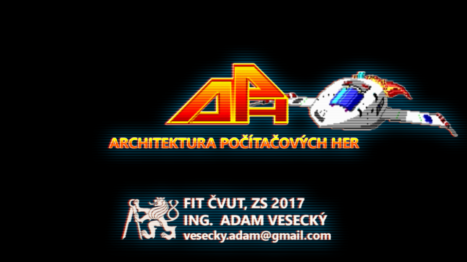
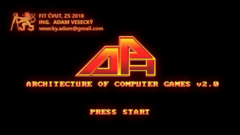 APH 2018
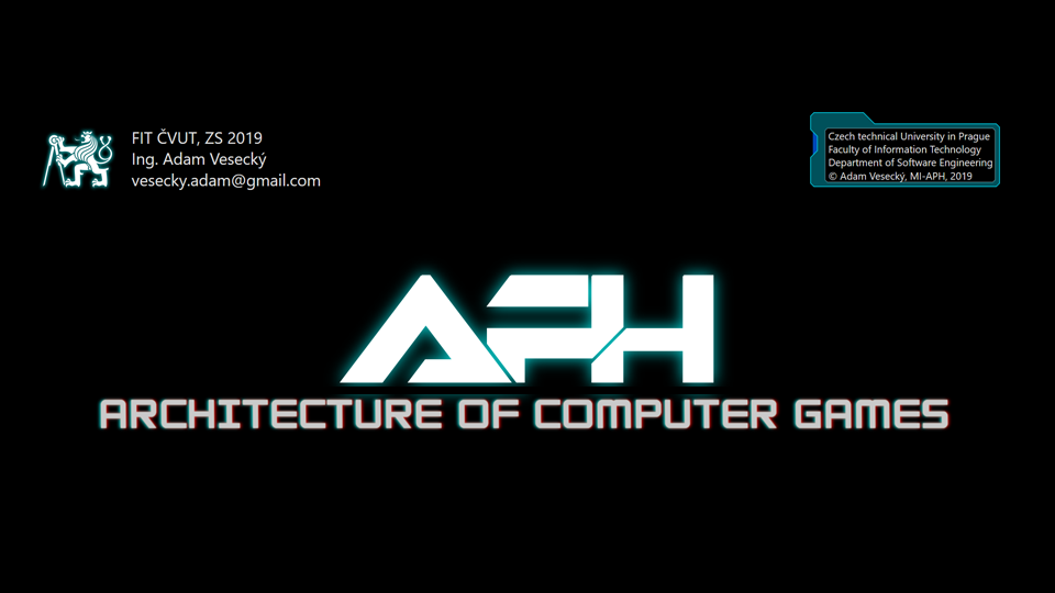 APH 2019
 APH 2020
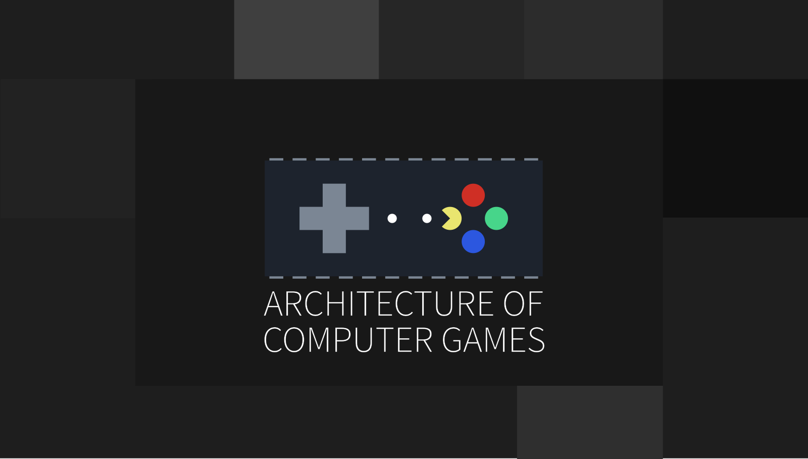 APH 2021
 APH 2022+
In 2017, the design consisted of a simple logo made of APH letters and a striped effect over all images. 2018 brought several changes to the design - slides were readjusted from 4:3 to 16:9 ratio, colors were carefully chosen and the striped effect was smoothened. In 2019, all slides were rewritten from PowerPoint into HTML, which brought new opportunities - interactive content, CSS animations, and themes. The logo could benefit from a new look, yet it still contained letters from the Czech title "Architektura Počítačových Her", which wasn't very convenient for a symbol. Moreover, slides were wrapped in fancy colored frames and titles were animated with a slight touch of chromatic aberration. Along with tech-like shiny backgrounds, the concept itself looked cool, but it couldn't do much justice the topic as a whole. Furthermore, these eye-candies found themselves distracting when one needed to study the content.
Ultimately, in 2020, a fully-fledged brand template was introduced - color palette, a logo that has a good ring to the course itself, and unique visuals, including a grid-like pattern for the slides, suggesting graph paper for architectural sketches. All fancy animations from 2019 have receded in a blaze of simplicity and minimalism.
In 2021, some minor changes were introduced - slightly modified logo and better color selection for the diagrams.
In 2022, final touches were made and the black-and-white version was promoted as the main version of the logo.
Logo
The APH logo is a graphic representation of the brand and the primary graphic element of its identity. The symbol is represented as a stylized microchip with joypad buttons on its surface - directional buttons on the left, ABXY buttons on the right, rotated by 90 degrees counter-clockwise, and tiny start and select buttons in the middle. The yellow Y button is cut out from the left, at the angle of 90 degrees.
The logo represents the mission, purpose, and message of the APH Games brand.
 APH logo technical drawing
 APH colored logo
Symbol
The symbol is represented by ABXY buttons that appear on the right side of the logo. It is a detachable part of the logo and can be used in specific cases, such as favicons.
 APH symbol
 APH symbol (black and white)
Logo Variations
Buttons can have the same color as the joypad (yet the cut out one must be brighter than the rest), and the cover can be removed. In case of a solid dark background, logo can be used without the cover. If the background has other distracting elements that could interfere with the readability of the logo, the default version should be used instead.
Colors
The APH palette is bright and consists of several primary colors and multiple secondary colors that provide a variety of possibilities on how to design the content.
Primary colors
- primary colors are lemon yellow, emerald green, royal blue, and tomato red
- these colors are to be used mainly for highlighting
- lemon yellow represents Pac-Man, the first game that introduced a character
- emerald green represents grass of first open worlds from Zelda and Pokémon séries
- royal blue is the color of sky from Super Mario
- tomato red represents lava from first platformers
Secondary colors
- secondary colors extend the pallete by modest manhattan color, distinctive and brightful aqua color, and pleasant matte azure
Light and dark shades
- every primary and secondary color has got their own light and dark variant
Contrasting colors
- midnight should only be used for backgrounds
- white color is a text color for labels. The default text color is Rhino 20
Shades of Grey
- shades of Rhino color are used to differentiate between layouts and shapes
Gradients
- gradients are not to be used lightly. In exceptional cases, they can jazz up the look-and-feel of some diagrams.
Typography
Typography is crucial for the content. It must be simple, sleek and easy to read, as the content is intended mainly for education.
Serif font
The primary font is Source Sans Pro. This font is used for written content, as well as some diagrams. Its light version slightly resembles OCR-B font, developed in 1968 for technical documentation.

Monospace Font
Monospace font is Inconsolata and should only be used in code snippets and inside diagrams, in cases where serif font seems to be inappropriate.

IBM VGA Font
PxPlus IBM VGA8 is an old bitmap font for IBM PC. Despite its very good readability, it's only intended for special cases, such as quotes and ancient code snippets where it can differentiate the content from other examples.

Diagrams
Diagrams combine UML components and sci-fi HUD elements. The preferred color is royal. Other colors should only be used to highlight respective parts.

Code Snippets
Source code is parsed by prismJS. Primary colors are emerald, royal and tomato light.
function createIterator(array) {
    let currIdx = 0
    return {
        next() {
            return currIdx < array.lenth ? {
                value: array[currIdx++], done: false,
            } : { done: true }
        },
    }
}
Slides
All slides are wrapped in a round frame of a grid-like pattern, suggesting architectonical graph paper. The frame is semi-transparent and the background may be any picture that is relevant to the content.